Help is close by
Brand identity for Räddningstjänsten Östra Götaland
The assignment
Visual identity
Employer brand
Always within reach - in many ways
Räddningstjänsten Östra Götaland (The Östra Götaland Rescue Services) are always close by. Geographically, emotionally, in everyday life. This was the starting point when we assisted them with their branding work.
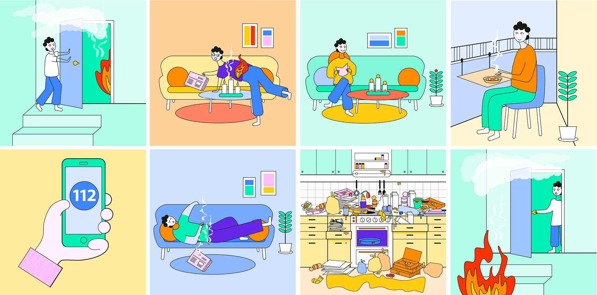
Räddningstjänsten Östra Götaland has a lot of contact with residents and the surrounding community, not least to disseminate advice and preventive information about fires, ice safety, traffic, and other safety work. Additionally, there is a significant need for recruitment.
The authority lacked a communication toolkit and a clear employer brand. As the contracted agency, Byn had the honour of helping to contribute to this.
Following insight work, which included a workshop with key employees at RTÖG, we began building an overarching message platform, an employer brand, and an update of the authority’s graphic profile.
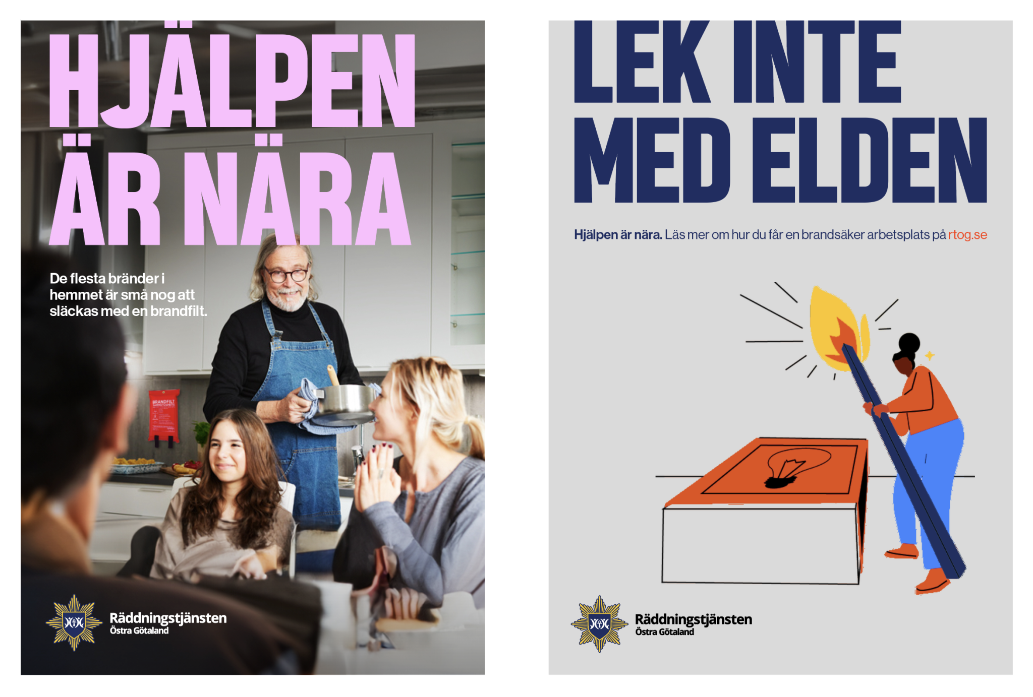
The Rescue Services should always be close.
The brand development work took its starting point in the concept of closeness. Räddningstjänsten Östra Götaland is close to the residents geographically, in their everyday lives, and emotionally. And when it works best, they have laid the groundwork so that residents have help right at hand, in the form of equipment and, not least, knowledge.
Therefore, we let the message platform revolve around the expression ‘Help is close’.
”We are your rescue services, and we are there where you are, when you need us the most – and so that you need us as little as possible.”
All forces are needed
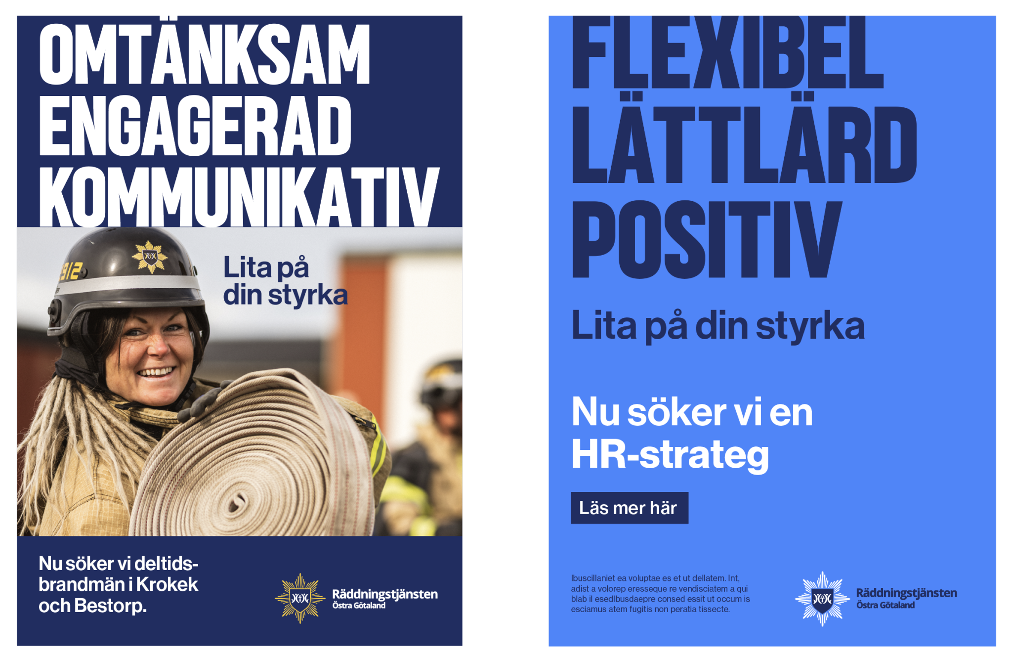
For the employer brand, we used a different tagline.
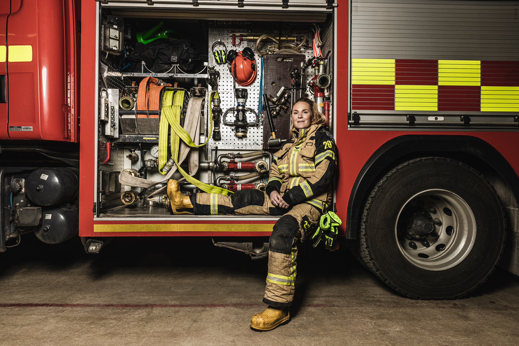
For Räddningstjänsten Östra Götaland, it’s important to move away from the image of their personnel consisting solely of large, strong, male firefighters. With the message “Trust your strength,” we wanted to highlight all the strengths that can be useful in the workplace, and which are not just about physical muscle power. The expression is always used in a context where this is clear.
Broader graphic profile
The graphic profile received a facelift and a broader palette. We streamlined the logo, expanded the colour palette, created a new illustration style, and added a soft but clear headline typeface, well-suited for clear messages – both regarding important public information and recruitment.
A great assignment for a client with an important mission!